DIALOG | Connect to Protect
Educating Parents and Guardians of Gamers
Brand Identity
Ad Campaign
Website Design
Conceptual Project
Deliverables:
Visual branding + identity
Identity manual + guidelines
Print advertisements
Motion graphic advertisement
Responsive website design
What is DIALOG?
DIALOG is a non-profit dedicated in their mission to educate parents and guardians about video games.
The goal is to provide information and education necessary for parents and guardians to know what their child is playing, how much time they spend playing, and who they may be speaking to while playing online.
“Connect To Protect” is DIALOG’s catchphrase to encourage parents and guardians to connect with their children over video games in order to protect them from potential risks.
Goals:
Include the audience within the identity to provide additional connection with brand and consumer
Showcase the possible risks of over usage of video games in an approachable manner
Not to rely on video game imagery when discussing the topic and broaden the visual identity and branding
Craft a digestible ui/ux website application that provides parents and guardians with information and context
Programs:
Adobe Illustrator
Adobe Photoshop
Adobe InDesign
Figma
Challenges:
Creating a organization discussing video games but that is not for video games’ target audience
Deciding on deliverables that would caught the eyes of the intended audience in their daily routines
Crafting a brand identity that implies video games but doesn’t mainly video game imagery
This is where creative magic happens… after research!
The Current Situation
Not all parents and guardians know what content their children are being exposed to, what ratings are appropriate for their children, or what being a parent to a gamer looks like or how to go about it.
The Desired Situation
Parents and guardians would be able to connect with their children with video games, understand that not all video games are made with children in mind, and educate themselves about online safety while creating a healthy relationship with gaming.
The Consequences
Children will continue to be at risk of exposure to mature content, development of various technological based addictions or disorders, and online predators.
ESRB Rating Interpretations
The ESRB ratings are designed towards parents so they can make informed decisions about purchasing games for their children.
Based on the research conducting and studies, in all categories, under 50% of parents knew what the minimum intended ages were for ERSB ratings.
Credits:
Communications. Frontier. “Parents” Perceptions on Children’s Video Games Habits: Frontier.” Internet. Phone & amp:
TV Service Provider, frontier.com/resources/e-is-for-everyone-video-game-study. Accessed 2 Dec. 2023
Pixels to Pixel, Bit to Bit
The overall inspiration comes from that creates the visuals in video games - pixels. The pixels can symbolize the increasing levels of understanding about video gaming.
A Face to a Name
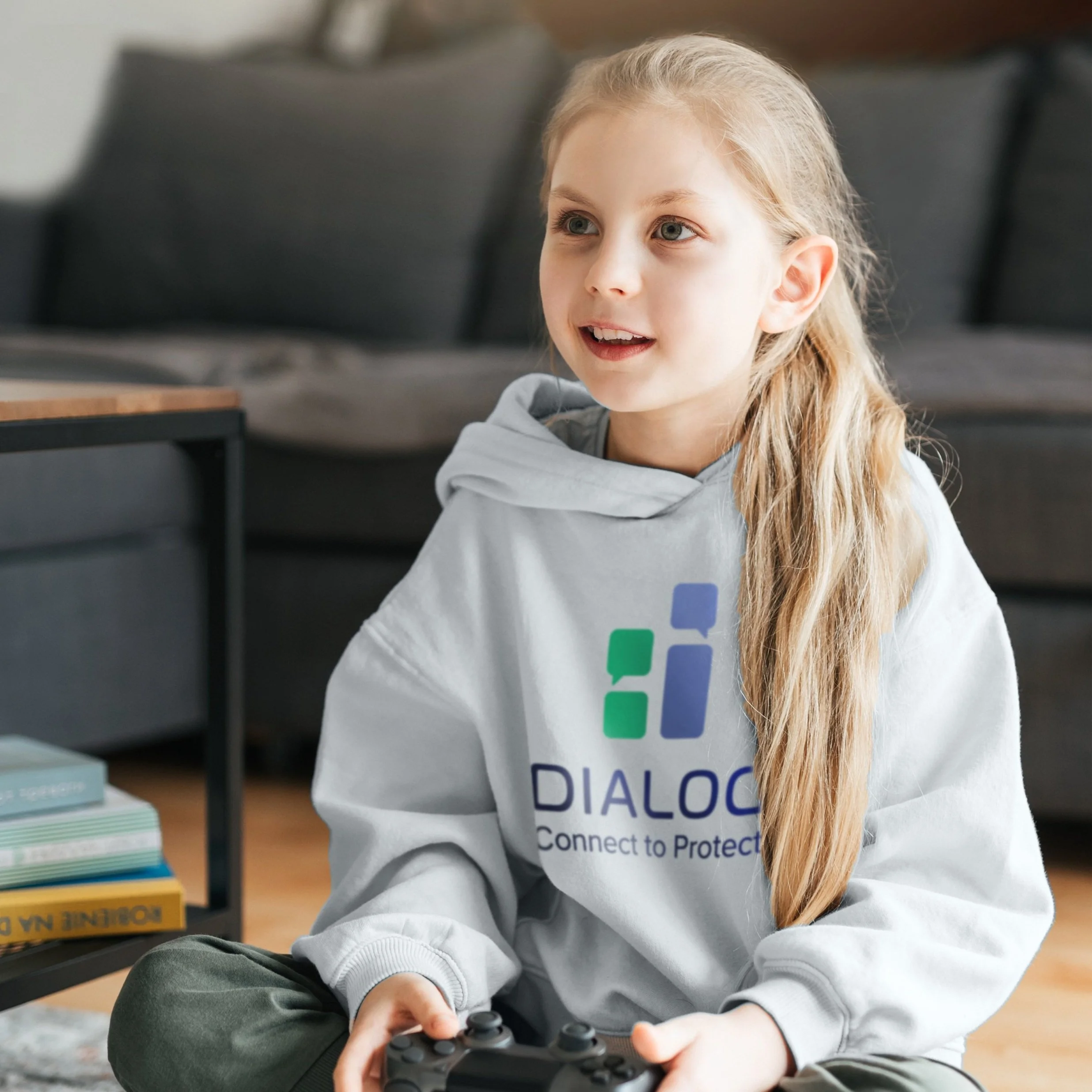
The brand identity was to clearly represent parents and guardians with their children. The name stems from the idea or feeling of video games but what the word “DIALOG” stands for.
Print Advertisements
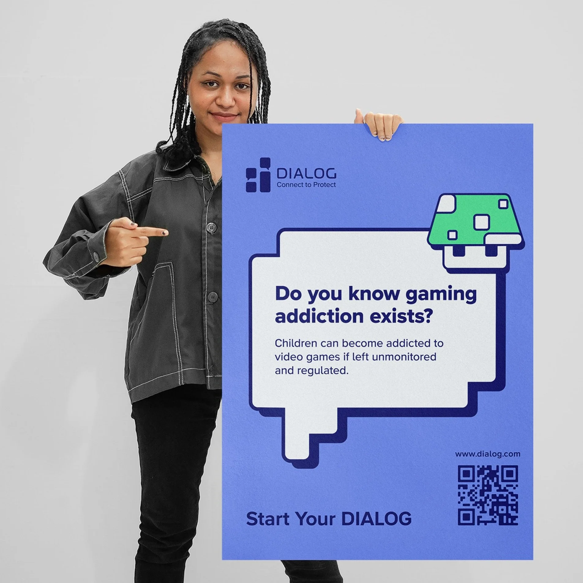
Print advertisements would inform parents and guardians about the risks of video games and about the organization’s website. These ads would be placed where children and parents/guardians would frequent occupy such as doctor offices, K–12 schools, and public play places.
Motion Graphic Ad
A motion graphic advertisement was created to reach parents and guardians on a digital platform and bring awareness to the risks video games could pose to children. This ad would be showcased on public digital posters, Youtube ads, and commercials on TV.
Responsive Website
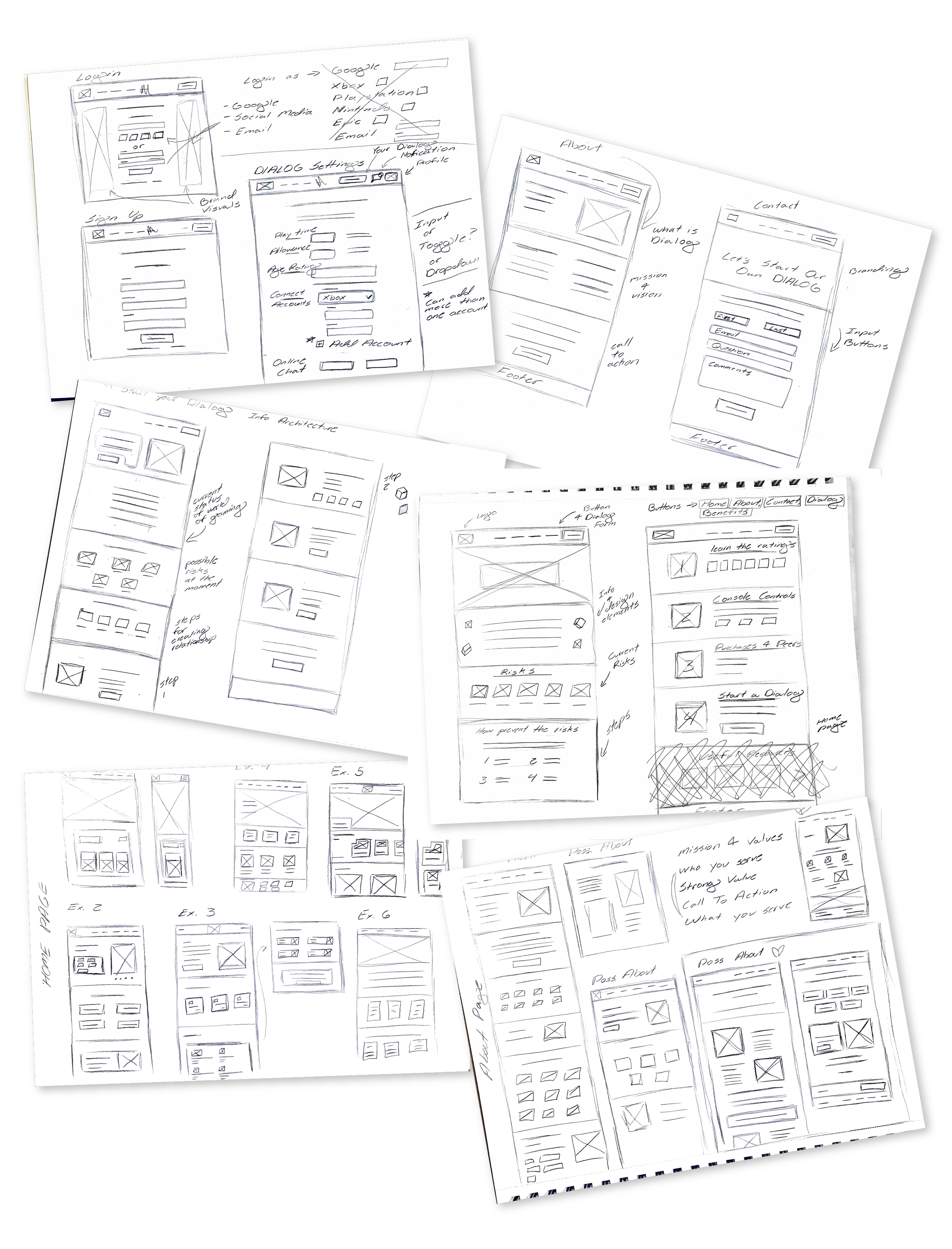
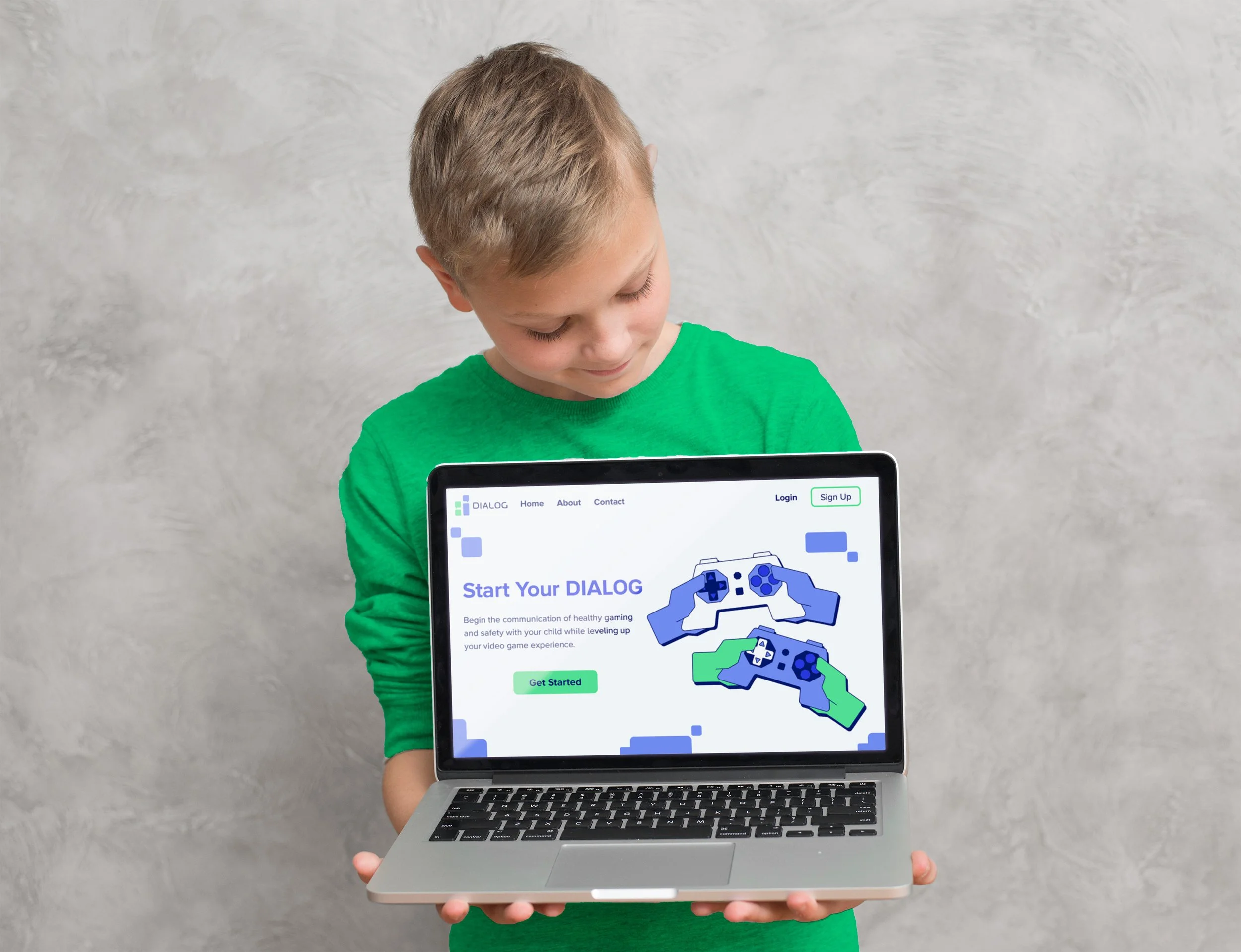
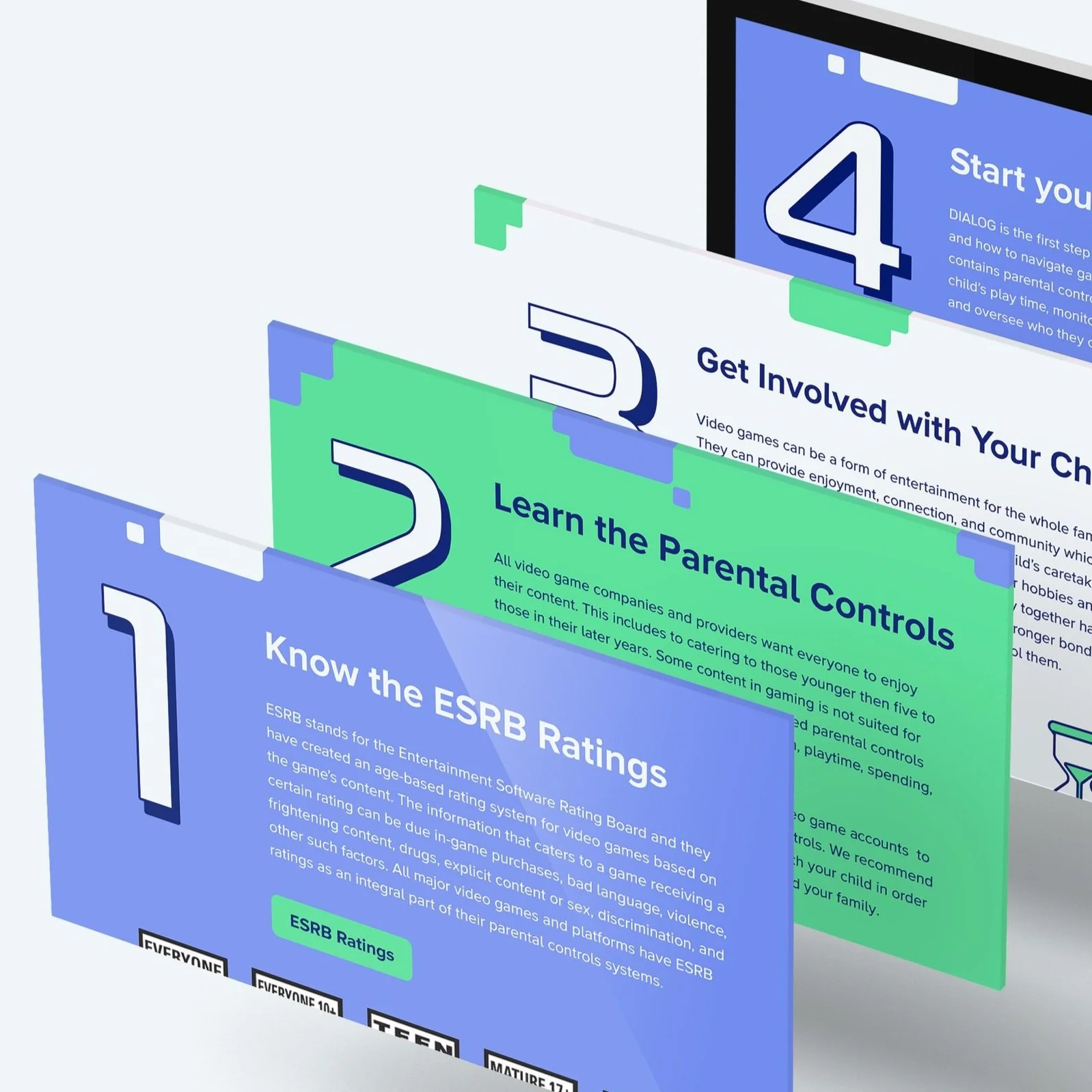
DIALOG’s website is where the dialog between the parent/guardian and child happens. Here, the parents/guardians can connect their child’s gaming account so they are about to monitor their usage. It would also allow for their child to game safely online and appropriate amounts.
Mobile View
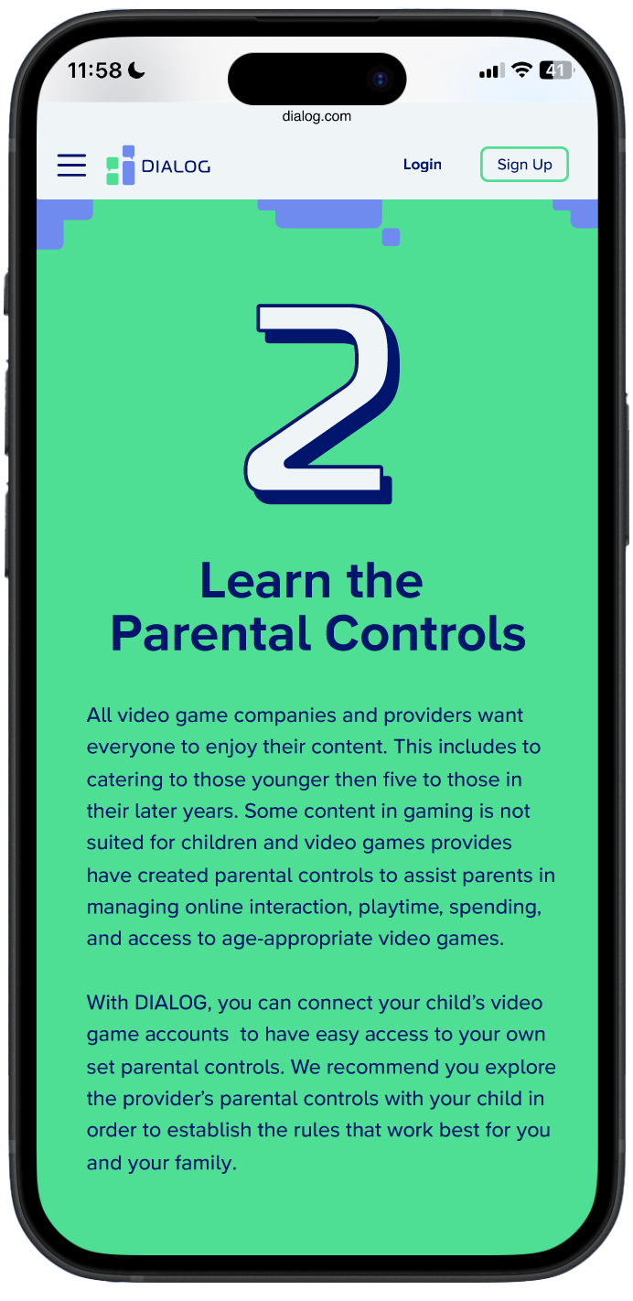
DIALOG’s website is easily assessable via desktop or phone which allows parents and guardians to easily monitor what their child when gaming.

